I started writing Atlas Pulse in late 2012 to communicate my thoughts on gold in an era where my employer at the time made it more difficult to communicate with the public. I had been a commentator on CNBC and Bloomberg TV since 2002, banging the drum on gold, and that then ceased to be. Atlas Pulse was born, published under a pseudonym, and 100 issues later, here we are.
Highlights
Track Record: Solid
Technicals: No Bubble
Models: Atlas Pulse Creations
History: Long-term Comparisons
Bitcoin: The Upstart Closes in
Atlas Pulse Track Record
There has been a resounding track record that has successfully navigated the gold market. There should have been more issues, but I wrote them more seldomly during the quiet patch between 2014 and 2018, as there was little to say at the time.
The dial above indicates the state of the gold market, and it hasn’t moved since December 2018. That doesn’t mean I haven’t thought about it for each issue. It has remained on “bull” because that’s where we are. I felt this was a useful way to communicate the state of gold, which, as a long-term asset, only needs to be flagged when things go wrong. They aren’t, so according to Atlas Pulse, gold remains in a bull market.
Track Record Since 2012
I cut gold in early 2013, taking the weight in the portfolios I managed at the time from over 10% down to 1%. The sell call wasn’t difficult because we had come out of a period of euphoria, silver was sliding, and real interest rates were about to surge. Inflation was low, while bond yields were rising, and the Euro crisis was coming to a resolution.
The buy in early 2016 followed the China slowdown and the bear market in commodities in 2015. The dollar had peaked, and real interest rates had settled down. The low for the gold price was in. Then, by late 2018, real rates were about to collapse, and the bull market, which started around 5,000 BC, resumed. Atlas Pulse was on it, and the price has risen 126% since.
Technicals – No Bubble
I stick with buy because the gold market has evolved once again, as it has many times over the years, and there are still no signs of a bubble. At the 2011 peak, silver was in the lead, peaking in April at $50 ($49.80 intraday), while gold carried on into the summer. A rich silver price is a sign of trouble, as it implies the animal spirits are riding high. The gold-to-silver ratio (GSR) fell to 32, which is very low, implying silver is expensive compared to gold. Today, the GSR is 85, which is cheap. That suggests the level of speculation in precious metals is low.
Gold-to-Silver Ratio
I have used a 50-year regression, which clips the GSR by 0.6% each year. On that basis, the middle of the range is 78. If you assume a constant, that would be 65, implying silver was very cheap. But, since the GSR was 15.5 in 1717 when Sir Isaac Newton was the Master of the Royal Mint, we should assume the GSR will rise over time because gold is the world’s primary monetary asset, and silver isn’t. Nor is Bitcoin, for that matter, but it’s certainly having a go, and we will come to that later.
Models - Atlas Pulse Creations
Over the years, Atlas Pulse has brought much to the gold market, with a focus on how investors should think about gold. In around 2012, I modelled the gold price as a 20-year TIPS (US inflation-linked government bond). In modelling gold as a bond rather than an equity or a commodity, as was popular at the time, it started to make sense. I asked the question: if gold was a bond, what kind of bond would it be?
It is zero-coupon because it pays no interest.
It has a long duration because it lasts forever.
It is inflation-linked, as historic purchasing power has demonstrated.
It has zero credit risk, assuming it is held in physical form.
It was issued by God.
It got a few laughs, which is always a bonus, but when I modelled it as such, the results were incredible. That held until 2022, when the world changed with the invasion of Ukraine. It wasn’t the war but the use of reserves and the dollar as a weapon. Gold changed roles and became a neutral asset that couldn’t be ceased. Investor demand peaked in 2020, but then the central banks stepped in.
The Gold TIPS Model
On the basis of the TIPS model, gold is currently 104% overvalued, with a fair value of $1,313. The fall in fair value can be attributed to higher interest rates since 2022. Bonds collapsed that year, and if gold is a bond, so to speak, it should have collapsed too.
Yet it didn’t because the regime changed. Most analysts and strategists turned bearish, and being a gold bull in 2022 became lonely. I reduced some gold exposure in the portfolios in favour of TIPS, but that didn’t work because inflation expectations followed the surge in inflation, keeping a lid on the price of TIPS. Still, I held on to the majority of the gold and still hold a large position to this day.
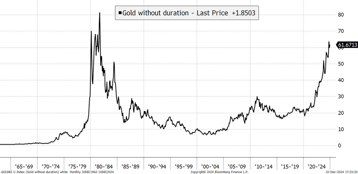
Despite the demise of the TIPS Model, gold still moves inversely with US real yields, just not to the same extent. China has become more dominant in the gold market, and high demand from the global central banks has taken gold well beyond US inflation. Over the years, I had increasing doubts about gold being an inflation hedge and more of a financial asset that would keep up with monetary inflation or the money supply. I’ll get to that, but in the meantime, my revised gold bond model is gold without duration. That is, you take the gold price and strip out the 20-year bonds living within. This is the result.
Gold Without Duration
When you take out the bond within, something is left, and that is interesting. Gold without duration tells investors when gold is offering something beyond the diversification offered by bonds. When this line is trending, be sure to stay long. I believe it is closely related to future expectations for monetary inflation.
History - Long-Term Comparisons
The world’s above-ground gold supply amounts to 212,000 metric tonnes or 6,834,674,880 Troy Ounces worth $18.53 trillion. Last year, 4,953 metric tonnes were mined, an increase of 2%. Looking back to 1765, we get a sense of how stable gold’s supply growth has been over the years. The long-term average has been 2%, against 2% today. Can you spot when the gold rush happened?
Gold’s Annual Supply Growth (%)
The gold rush of 1848 came about at a time of low supply growth, where 300,000 people flocked to California in search of riches, with the most successful being those selling shovels. We don’t know what the above-ground supply looked like before the 1700s, but it was much more than zero. This data enabled me to calculate gold’s market cap over the long term for economic comparisons.
I use US data because global data is so hard to get over the long term. Pre-1960, the USA made up 40% of the world economy, which dropped to 21% in 2012. The tech boom has seen it rise again, just as the rest of the world has slowed, so it is 26% today. It is important to remember it’s not 100% but indicative, nevertheless.
Gold to nominal GDP is something I have recently been writing about as the World Gold Council adopted it for their expected return framework. Currently, it looks high since 1928 but would surely be lower if we had global data. The historic average has been 18%, whereas today, it is 64%.
Gold Market Cap to US Nominal GDP
Before you fall off your chair, that was the gold market cap against GDP, not the price. My supply data goes back to 1671 but is sketchy in places. Sadly, the GDP data only goes back to 1928. There is a huge difference between the market cap and the price, especially over the long term. Gold’s cap is driven by the gold price compounded by the rate of new supply at around 2% per annum. Over the decades, that soon adds up. The gold price has lagged the nominal GDP significantly, whereas the market cap has matched it.
Gold Price to GDP and Gold Cap to GDP
The WGC’s recently launched expected return framework suggests the gold price should follow nominal GDP, which is growth plus inflation, which matches the money supply. The gold price was fixed pre-1971, which is why it lagged GDP by so much. It’s funny how it has reached 60% of GDP on three occasions.
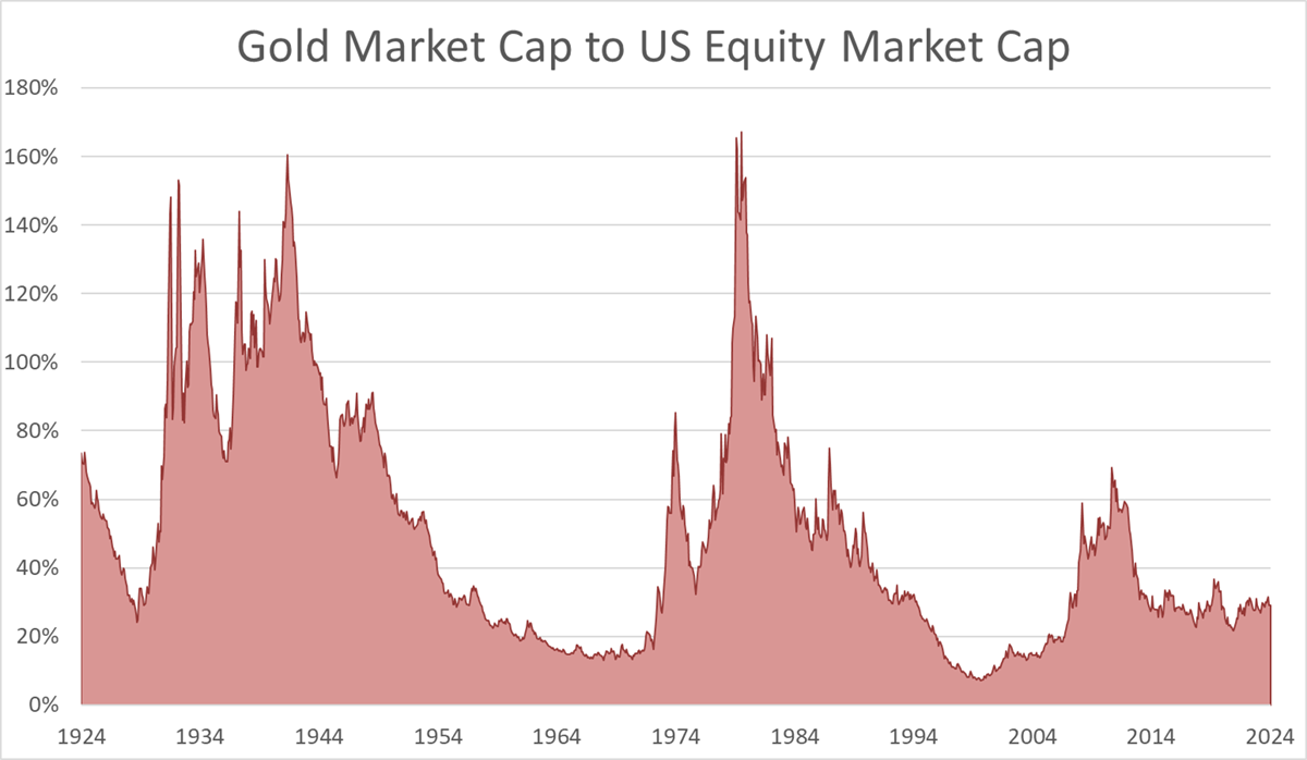
Gold’s market cap is useful in comparing the size of asset classes, much more so than price. The gold cap currently makes up 29% of the US stockmarket, against a historical average of 50%. The war years saw this much higher, as did the inflationary era of the 1970s. I suspect the current level will be much higher a decade from now. Even 2011 wasn’t that much of a bubble by this measure.
Gold Market Cap to US Equity Market Cap
Comparing gold to the US Treasury Market (the debt ceiling), gold’s market cap is in line with history at 52% against a historical average of 55%. Bonds collapsed in the 1970s, which explains the spike at that time, and in the 1920s, the US government was frugal. Treasury issuance was falling and only grew to support the economy to fight off the Great Depression in the 1930s.
Gold Market Cap to US Treasury Market Cap
This neatly brings us to the stock-to-flow ratio (S2F), which is currently 43.8. This is simply the reciprocal of the growth rate of new supply. A 2% supply growth is the same as saying the S2F is 50 (1/0.02). Gold’s S2F surged ahead of the gold rush, which resulted in a brief collapse as the prospectors came home with new metal.
Gold Stock-to-Flow Ratio
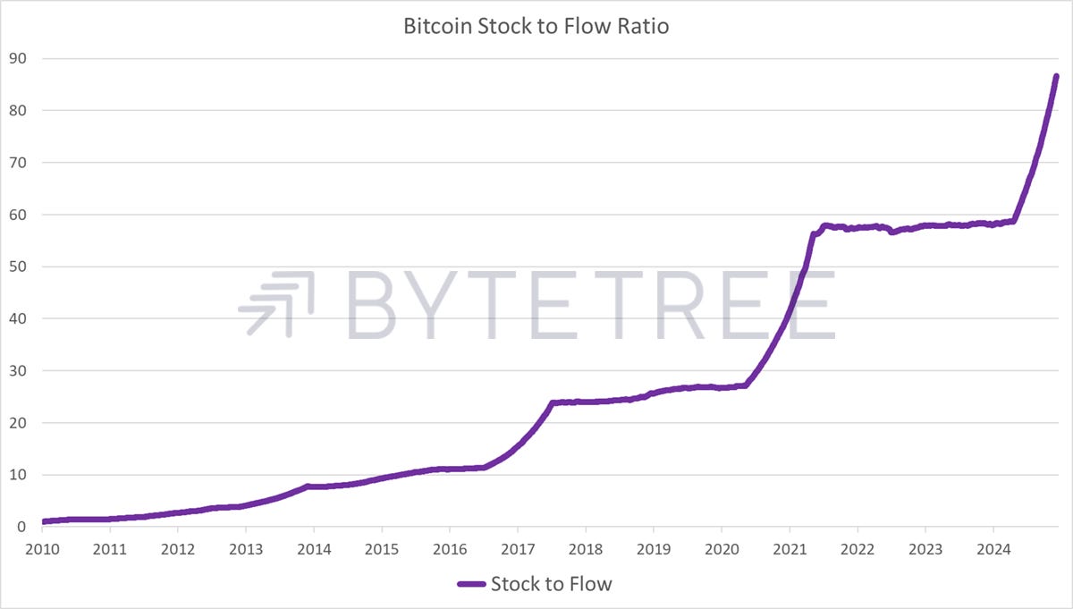
Much has been said about Bitcoin’s superior S2F ratio, which is nearly 90 and rising to infinity. I have always liked that, but point out that low supply doesn’t create value alone. Supply is important, but so is demand.
Bitcoin Stock-to-Flow Ratio
Atlas Pulse first covered Bitcoin in November 2013, when the price was closing in on $1,000. The prediction was to expect an 80% to 90% correction, which happened in 2014. I built a fair value model, which measured the network effect. I regularly publish this model on ByteTree in ByteFolio, our weekly crypto publication. The model showed the Bitcoin Network was growing rapidly by late 2015 while the price lagged behind.
Bitcoin Fair Value Model
The good news is that the Bitcoin price today is still in line with the network, having fought off the slump in 2022. This, along with others, has been useful in keeping a level head in a volatile market.
The Chairman of the Federal Reserve, Jerome Powell, recently said that Bitcoin is a competitor to gold, not the dollar. While Bitcoin’s growth is impressive, there will always be differences between the assets. I am one of the few that see Bitcoin and gold as complementary assets rather than competitors. Gold behaves like a bond, while Bitcoin behaves more like a growth stock.
BOLD
Writing about Bitcoin and gold since 2012 left its mark. I decided it wasn’t about choosing between the world’s most liquid alternative assets but combining them. It led to the creation of the Vinter ByteTree BOLD Index, which is tracked by the 21Shares ByteTree BOLD ETF listed in Switzerland. The asset allocation has kept it resilient, while the modest allocation to Bitcoin (approx. 3:1, Gold to Bitcoin) has significantly enhanced returns for gold investors with only a modest increase in risk due to their non-correlation.
Bitcoin, Gold, and BOLD - Since ETF inception
If BOLD is too dull, and you want to beat Bitcoin, then simply apply 3x leverage, so the risk is equalised, and hey presto, you’ll own 75% Bitcoin and 225% gold. You’ll smash Bitcoin with that strategy and still have taken a little less risk. Learn about BOLD on the BOLD.Report website.
Summary
In 100 issues, Atlas Pulse readers have got gold right, and some even bought Bitcoin in 2015 at $250. They made 126% in gold and 400x in Bitcoin. There is one video, which has survived from 2016, that tells the story.
Thank you for reading the last 100 issues of Atlas Pulse, the Gold Dial remains in Bull Market.
Charlie Morris is the Founder and Editor of the Atlas Pulse Gold Report, established in 2012. His pioneering gold valuation model, developed in 2012, was published by the London Mastels Bullion Association (LBMA) and the World Gold Council (WGC). It is widely regarded as a major contribution to understanding the behaviour of the gold price.
We would love to hear your feedback, so please share your thoughts in the comments below or contact Charlie at charlie.morris@bytetree.com. It would really help us if you could like, restack/share this update and subscribe to our Substack. Thank you so much for your support!


Well done Charlie, you’ve stood the test of time and your pulse is racing at the big 100 !